


Time Series and Forecasting with Python code examples (Part I)
A series on how to predict the future


A Time Series is just a set of data collected in a certain time span. For example, the weekly values of some stocks, and the annual average precipitation indices in a country. They are widely used to predict future events like the expenses of next month, or the number of hurricanes in the Atlantic ocean for the upcoming season.
What do those examples have that makes them different from other datasets?
There is an implicit order relationship in the data, we can't just shuffle the data and work with it. It is extremely important which registry was collected before and which one after.
Another important characteristic (that supports the previous one) is that we assume there is some relationship between previous entries and future ones. In other words, we can write a data sample as Xn = f(Xn-1, Xn-2, ..., X1, S) + e, where S represents other parameters that can be useful to predict the value of Xn and e represents a random error. We call such a relation in which a term can be determined as a function of the previous ones a recurrence.
This post is the first in a series about Time Series and Forecasting. Here, we are going to explain the main components of a Time Series, how to measure the relationships between previous and future data of the Time Series, and the first steps to analyze a forecasting problem.
I include a practical exercise to illustrate what we'll be talking about. All using Python.
What do you think? Let's get started!
Time series and its main components
Let's define the most important features to look at in a Time Series.
From the fact of being a sequence of observations during a time span, Time Series can present some patterns that determine the way we analyze them.
Those patterns are:
Seasonality: When the data is affected by some seasonal factors such as holidays, seasons of the year, sports events, and so on. Those seasonal effects have a fixed frequency.
Trending: When the data seems to have a long-term increase or decrease in its values. Although most of the examples present this trending quality as a linear modification of the data, this increasing/decreasing behavior might not be linear.
Cycling: When there are other external factors with no fixed frequency that affect the data during a long term. This could be due to economic conditions for example. This pattern is not equivalent to the Seasonality pattern. It usually has a longer period and, as I already said, its frequency is not fixed.
The following image illustrates how all the previous patterns can appear in a Time Series. The image is taken from Forecasting: Principles and Practice, which is an excellent resource to get started with Time Series.
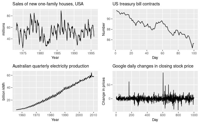
The top-left example shows a strong seasonality within each year, as well as some strong cyclic behavior with a period of about 6–10 years. There is no apparent trend in the data over this period.
The top-right example shows no seasonality, but an obvious downward trend.
The bottom-left example shows a strong increasing trend, with strong seasonality. There is no evidence of any cyclic behavior.
The bottom-right one has no trend, seasonality, or cyclic behavior. There are random fluctuations that do not appear to be very predictable, and no strong patterns that would help with developing a forecasting model.
It is important to note that the patterns identified above correspond with the time period that is represented in the graphs. If we had a longer period, other patterns could emerge.
An example
We'll be working with a dataset that represents the monthly sales of shampoo during three years. You can download it here
Let's explore the data!
import pandas as pd
import matplotlib.pyplot as plt

shampoo_df = pd.read_csv('shampoo.csv')

print(shampoo_df.head())
print(shampoo_df.shape)

#     Month  Sales
#  0  1-01  266.0
#  1  1-02  145.9
#  2  1-03  183.1
#  3  1-04  119.3
#  4  1-05  180.3
#
# (36, 2)
As you can see, the dataset contains 36 rows corresponding to the sales of 36 consecutive months.
Let's see what patterns are present in our data:
plt.plot(shampoo_df.Month, shampoo_df.Sales)
plt.show()
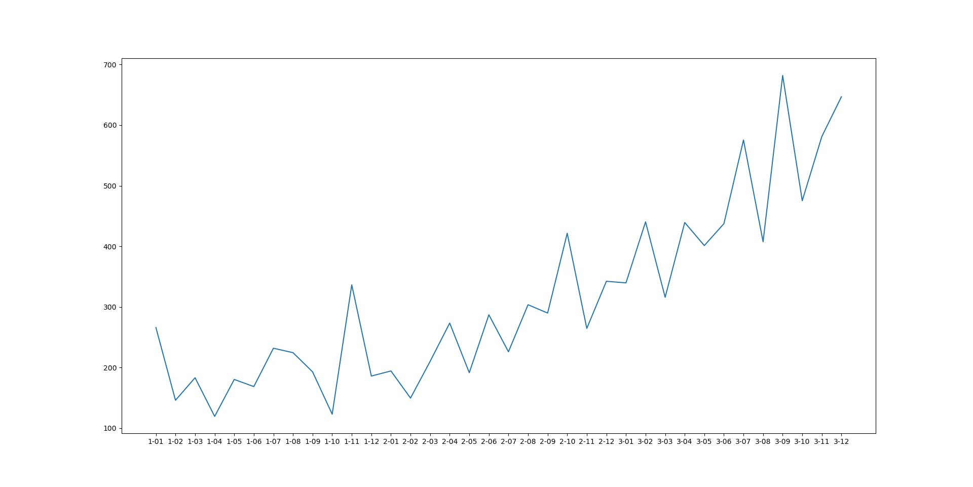
Here you can see a strong increasing trending and a perceptible seasonal pattern. There is no evidence of any cyclic behavior.
Cool! But... What's next?
Autocorrelation
The way we use the components of a Time Series is left for the next delivery of this series. I want to talk about other important feature that allows us to determine how predictable might be the Series we are working on.
As I mentioned in the first part of this article, we hope there are some recurrent dependencies between the elements of the Series (i.e. we can predict future values from previous ones). So, it is important to measure the relationship between the elements of the Series.
In other statistical problems, we are usually interested in the correlation between some pair of variables. That gives us a measure of the strength of the linear relationship between those variables. Besides the correlation between two different variables, there is another metric that we are interested in when dealing with Time Series: autocorrelation.
It is a very similar concept but this one is used to measure the relationship that exists between the previous observations and the most recent ones. So, instead of measuring a linear relationship between two different variables, we measure the relationship between the values of the same variable through time.
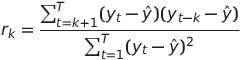
We can define multiple autocorrelation coefficients. What determines a coefficient is the number of past observations that we use. For example, the coefficient r2, is a measure of the linear relationship between every sample and the previous one; r3 takes into account the two previous observations, and so on. In general, the coefficient rk can be calculated as:
Then, we can plot every autocorrelation coefficient in what is called an autocorrelogram. Let's do it with our data!
acorr = pd.plotting.autocorrelation_plot(shampoo_df.Sales)
acorr.plot()
plt.show()
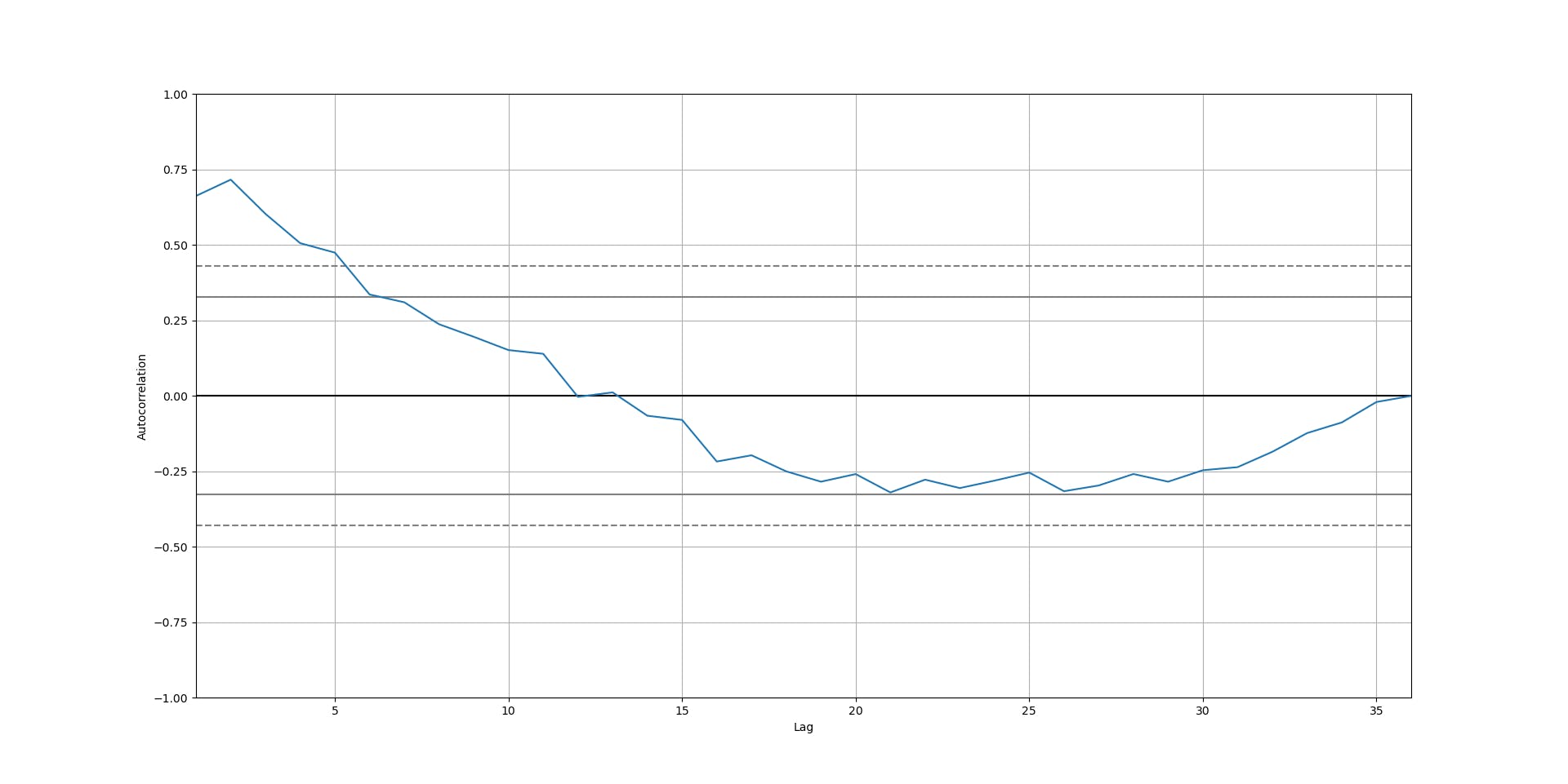
The continuous horizontal lines correspond to the values 2/sqrt(T) and -2/sqrt(T), and enclose a region with an insignificant strength in the linear relationship.
As you can see, there seems to be a strong linear relationship between the sales of a month and the sales of the previous one or two months, while there is not too much evidence of a linear relationship when we look at more than five lagged months.
Conclusions
Let's stop here. So far we have seen what a Time Series is, what are the main components of a Time Series, how to interpret them, and how to determine if there is a linear relationship between lagged observations.
In the next post, we'll learn how to decompose a Time Series in its multiple components, how to determine the best models to explain a Time Series, and much more.
So, be sure to stay tuned! You can subscribe to my newsletter and receive a notification so you don't miss any of my posts.
Want to get my content in a simpler format and be able to interact in a different fashion? Follow me on Twitter!
See you soon!
(Cover photo by Javier Esteban on Unsplash )